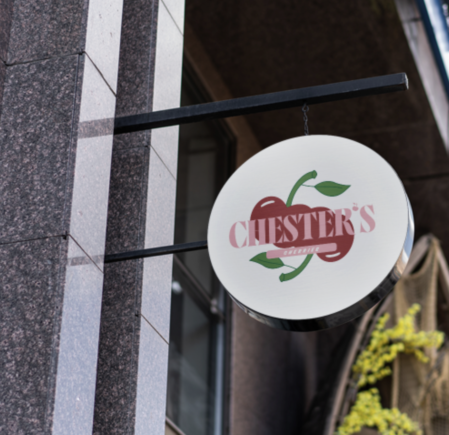
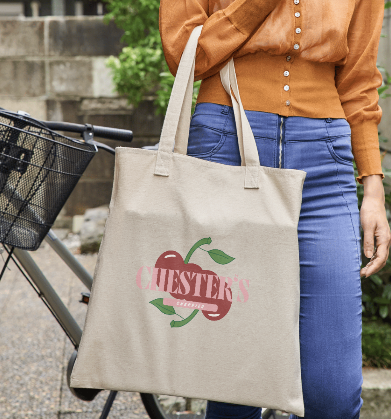
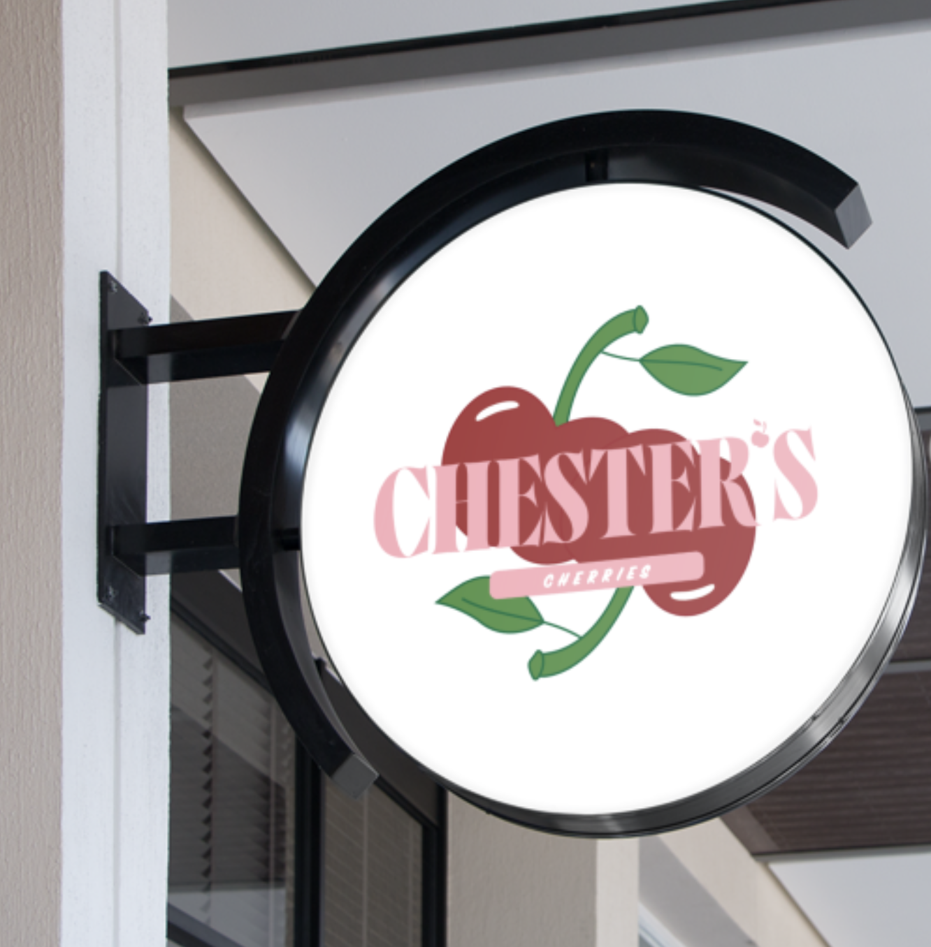
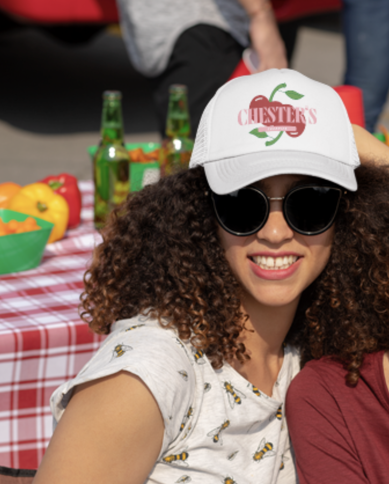
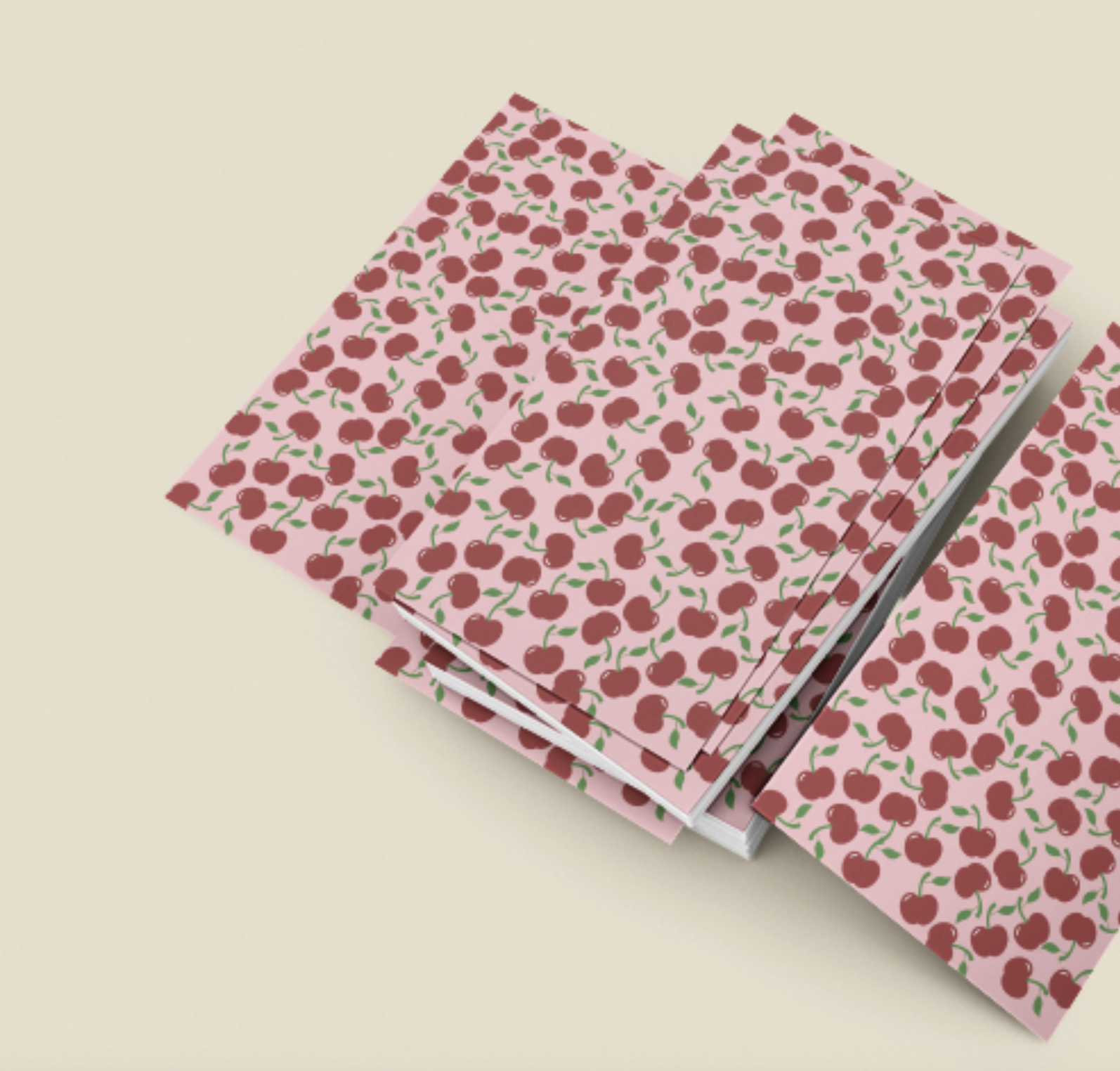
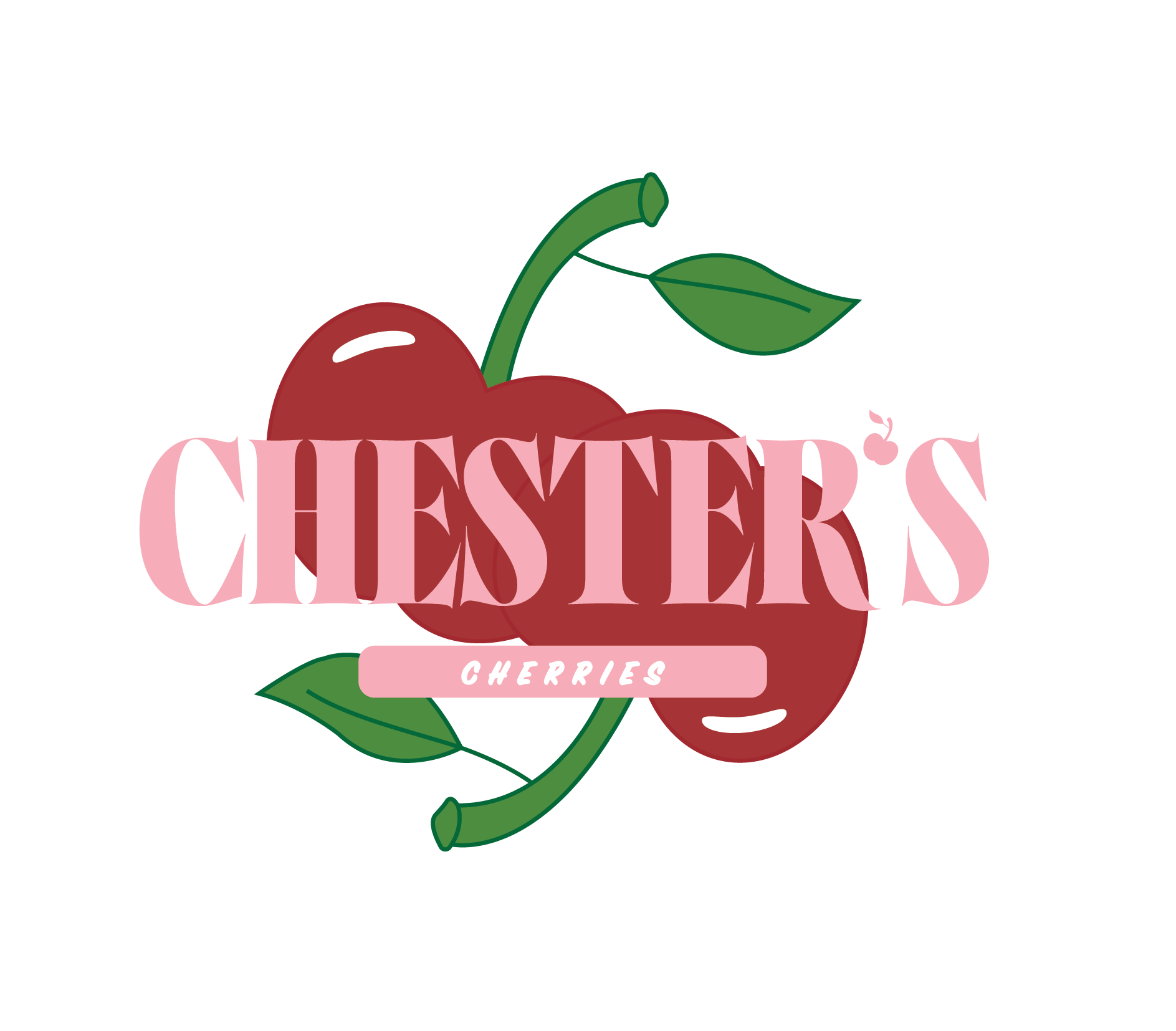
chester’s cherries
For this design, I was tasked to create a logo and business card for a brand that was based on a fruit. For my fruit, I choose a cherry. For this project, my class was challenged to try different types of styles along with playing with different types of fonts while successfully being able to bring those fonts onto paper.


Thumbnails
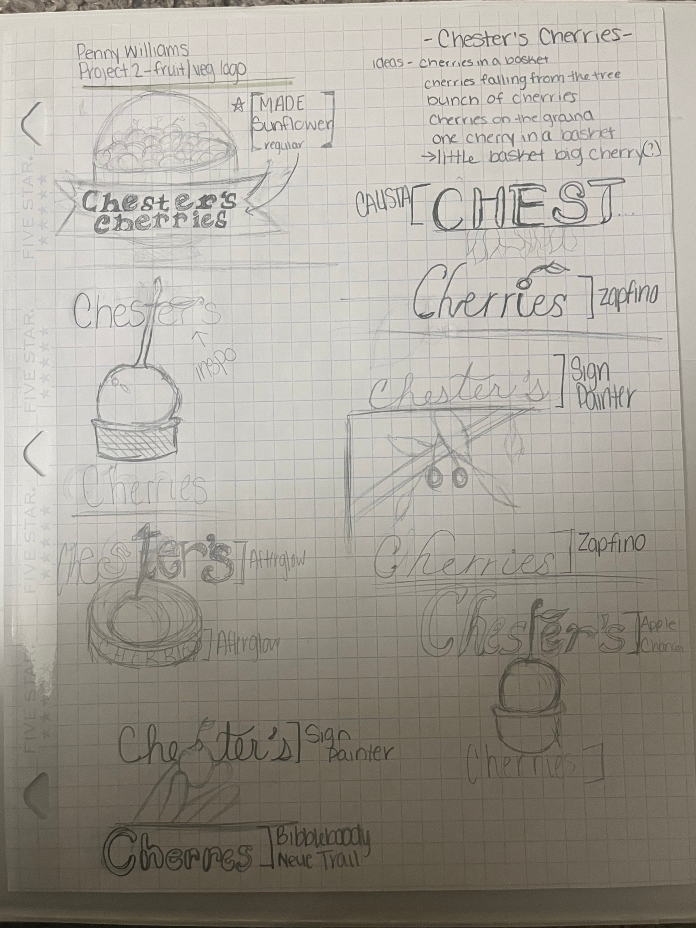

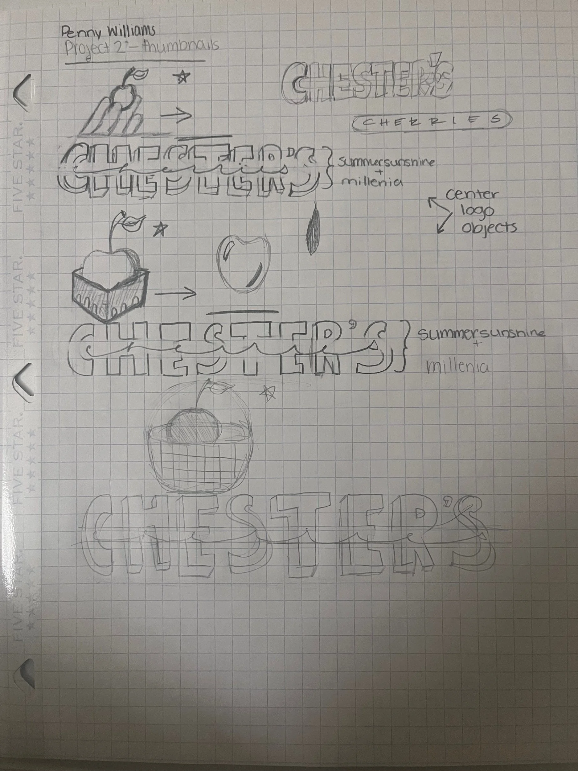
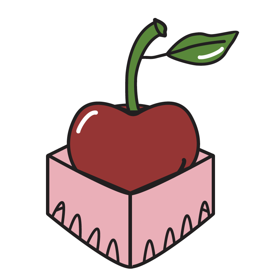
When generating ideas for my logo and focusing on using a cherry, my first thought was how I could emphasize the cherry by drawing many of them grouped together but after discussion with my professor at the time, I created some sketches that included the giant cherry bigger than the basket it would be in. I wanted the cherry to stand out as a bold, eye-catching element that could instantly evoke a sense of freshness, playfulness, and approachability. I considered its shape and color, naturally vibrant with the colors I picked. I didn’t want the cherry to be just a fruit; the goal was for it to become a visual metaphor of the brand identity.
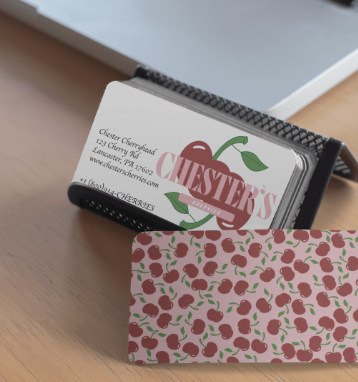
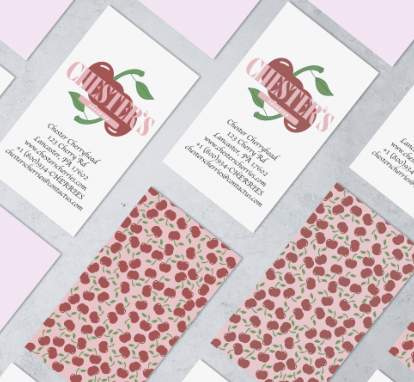
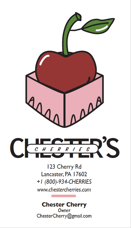
Business Card Design


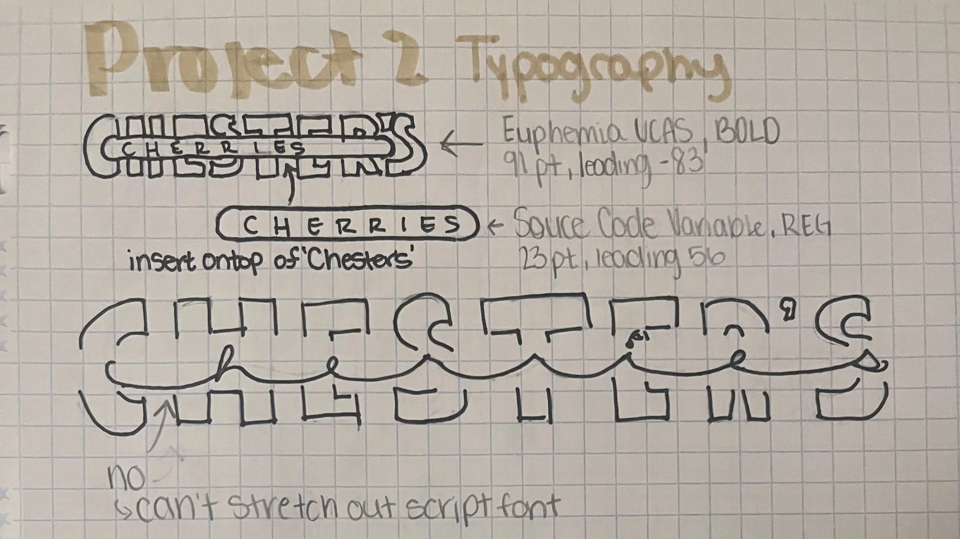
FEEDBACK
Couldn’t read “Chester’s” with cherries in front of it
LOGO KIT
In-Progress/OrIGINal Finished Design
final logo design (primary)
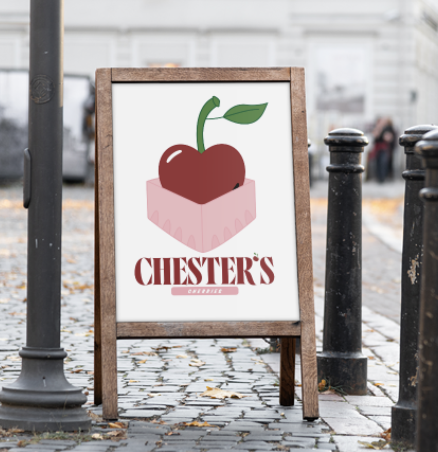
final logo Design
(secOndary)